Color
Choosing Colors for Texas Light
The right color on the chip can look wrong on the wall. Strong coastal light, undertones, and sheen change everything, so smart color choices start with testing, not guessing.
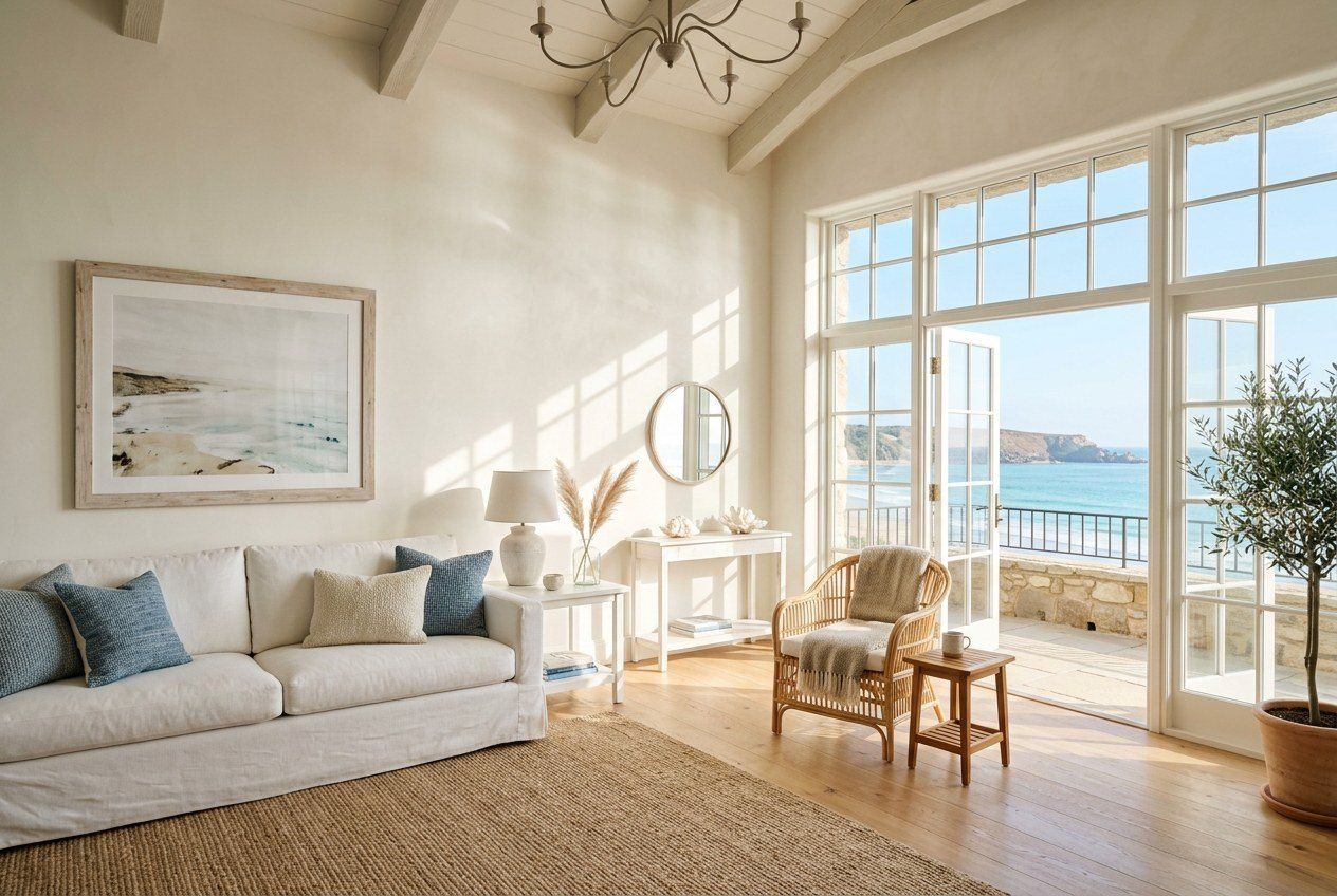
Color is the decision homeowners agonize over most, and the one they most often get wrong, not because they have bad taste, but because a paint color is not a fixed thing. It shifts with light, sheen, and the surfaces around it. On the Texas Gulf Coast, where sunlight is intense and abundant, that shift is dramatic. A shade that looks calm and neutral in the store can turn glaring or muddy on a sun-flooded wall. Choosing well means understanding how light works here.
Texas light is bright and warm
The Gulf Coast gets a lot of strong, warm-leaning sunlight. Bright light tends to wash out pale colors and can make bold ones feel more intense than expected. Warm light nudges colors toward their warm undertones, so a gray with a hidden yellow undertone can read almost beige on a sunny wall, while a cool gray can look flat and lifeless. North-facing rooms get softer, cooler light and can handle warmer colors, while south- and west-facing rooms get harsh, warm light that favors slightly cooler or more muted shades. Reading the light in each room before choosing is the first real step.
Understand undertones
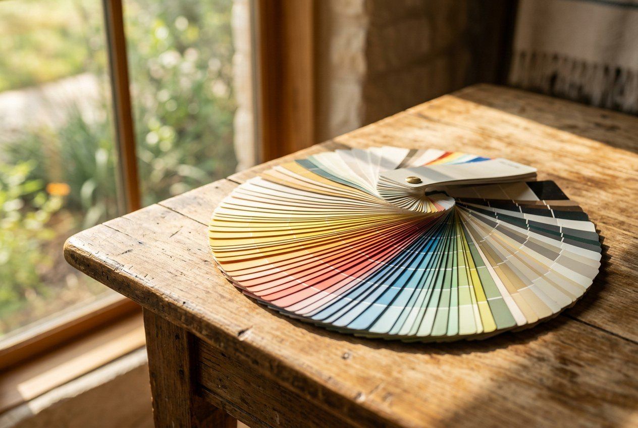
Every color carries an undertone, the subtle secondary hue underneath the main color, and undertones are where color choices go sideways. A "simple" white might lean yellow, pink, blue, or green, and that undertone becomes obvious once it covers a whole wall. The way to catch undertones is to compare candidate colors side by side; against a truer neutral, a hidden undertone reveals itself. Ignoring undertones is why a chosen white can end up looking creamy or cold in a way nobody intended.
Test big, test in place
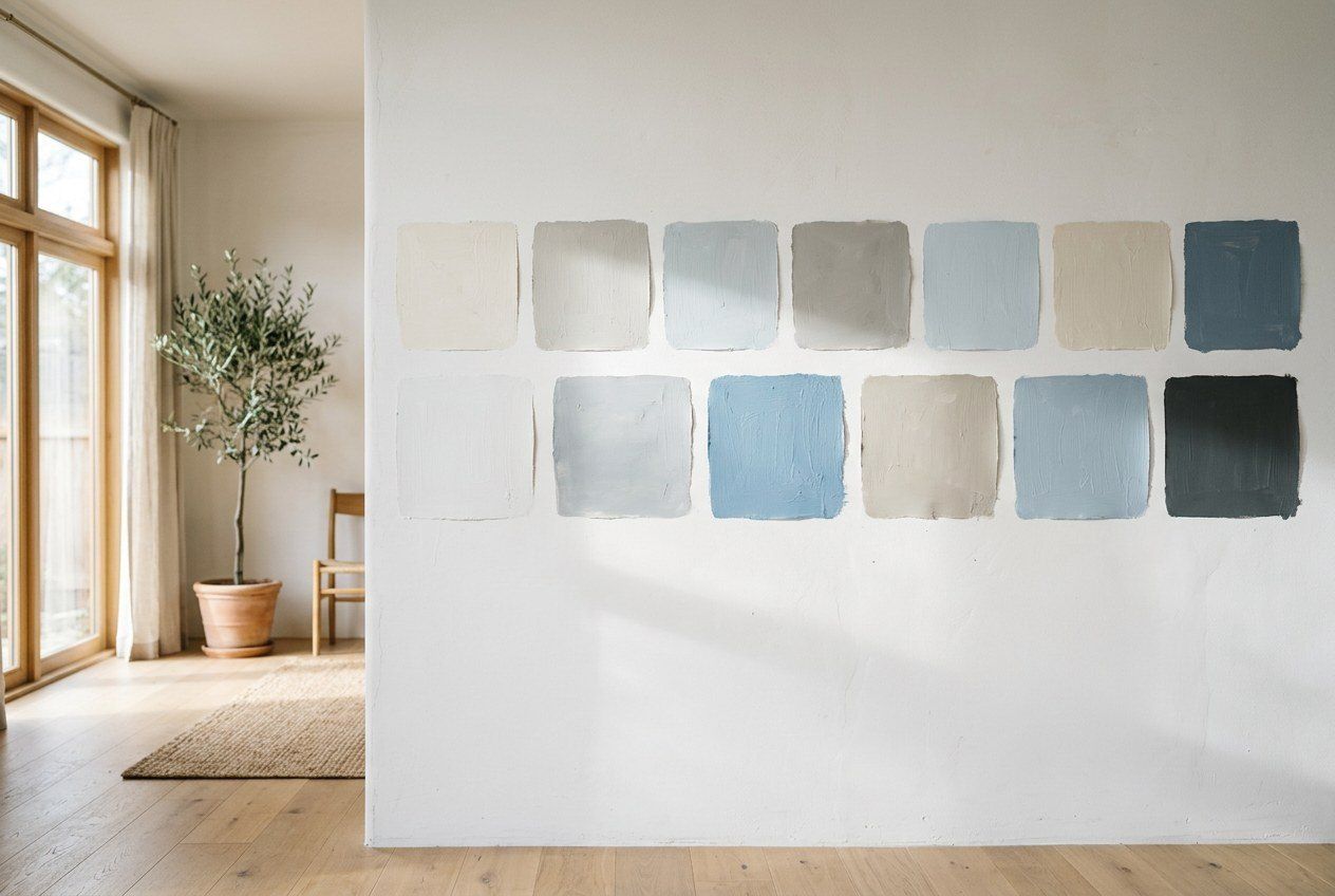
The single most valuable habit in color selection is to test large samples on the actual walls, not to decide from a small chip.
- Paint sizable swatches, at least a couple of feet square, directly on the wall or on large boards you can move around.
- Look at them at different times of day, morning, midday, and evening, because the same color changes completely as the light shifts.
- View them on more than one wall in the room, since light hits each wall differently.
- Live with the samples for a few days before committing.
This step costs a little time and prevents the expensive mistake of repainting a whole room that looked fine on paper and wrong on the wall.
Sheen changes the color
Sheen is not just about durability; it changes how a color reads. Higher-gloss finishes reflect more light and can make a color appear brighter and slightly different than the same color in a flat finish, which absorbs light and softens it. In bright coastal rooms, glossier finishes can amplify glare, so many homeowners keep walls in eggshell or satin and reserve semi-gloss for trim and wet rooms, the sheen logic laid out in interior painting.
Never choose a color from a chip under store lighting. Choose it from a big sample on your own wall, at the time of day you actually live in the room.
Coastal palettes and exteriors
Many Gulf Coast homes lean into light, airy palettes, soft whites, warm neutrals, and gentle blues and greens, that reflect heat and suit the coastal setting. Lighter exteriors also stay cooler and can hide the chalking that dark colors show as they fade under UV. Because exteriors face the full force of the sun, exterior color choices should be tested outdoors in direct light, and they connect directly to the durability concerns in exterior painting.
Flow across the home
Finally, colors should relate to one another as you move through the house. A cohesive palette, a set of whites, neutrals, and accent colors that share undertones, makes a home feel intentional rather than piecemeal. This matters most in open-plan spaces and in remodels where new and existing rooms meet, tying color decisions to the sequencing in remodeling basics and the material-heavy choices in kitchen and bath. Read the light, respect the undertones, test big, and let the palette flow, and color becomes the most rewarding decision in the project rather than the most stressful.
Don't fear neutrals, or a little color
Homeowners often swing between two anxieties: that a neutral will feel boring, or that a real color will feel risky. Both fears are overblown when the choice is tested properly. A well-chosen neutral with the right undertone reads as calm and sophisticated rather than bland, and it gives furniture, art, and light room to shine. A saturated color, used thoughtfully on an accent wall, a front door, or a smaller room, can add real character without overwhelming a space. The key in both directions is the same disciplined testing, big samples viewed in your own light at different times of day, that takes the guesswork out of the decision.